A few basic steps into Nikon’s RAW development
Table of Contents
- A few basic steps into Nikon’s RAW development
- The Setup
- The starting point—[FC] Flexible Color
- Pushing the look
- Nikon’s Film Grain
- Conclusion
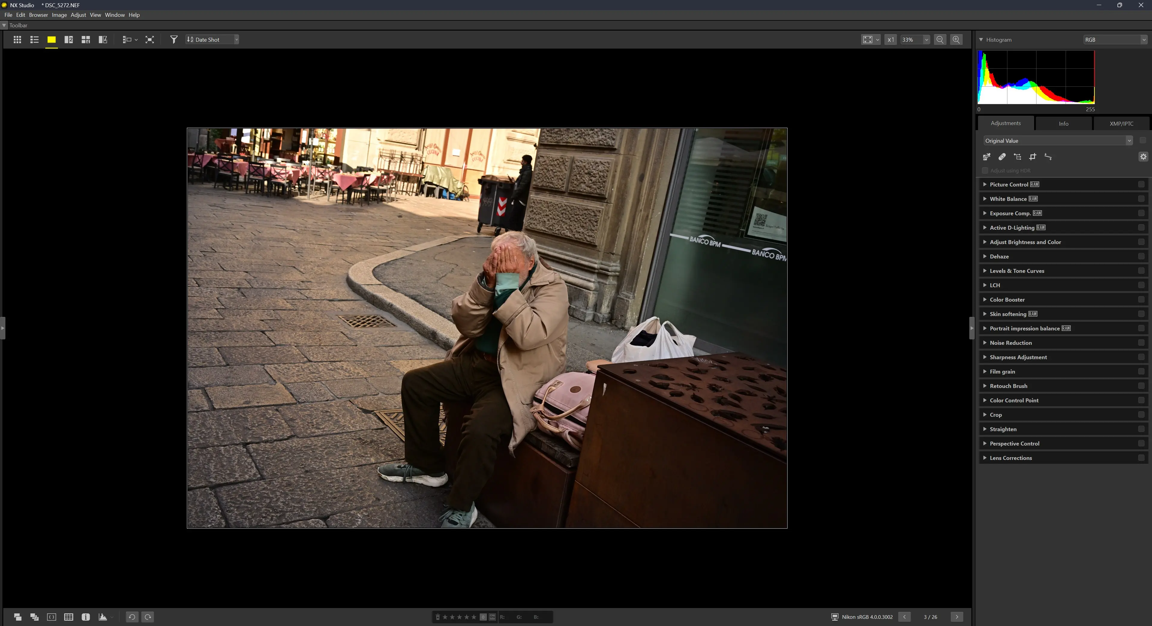
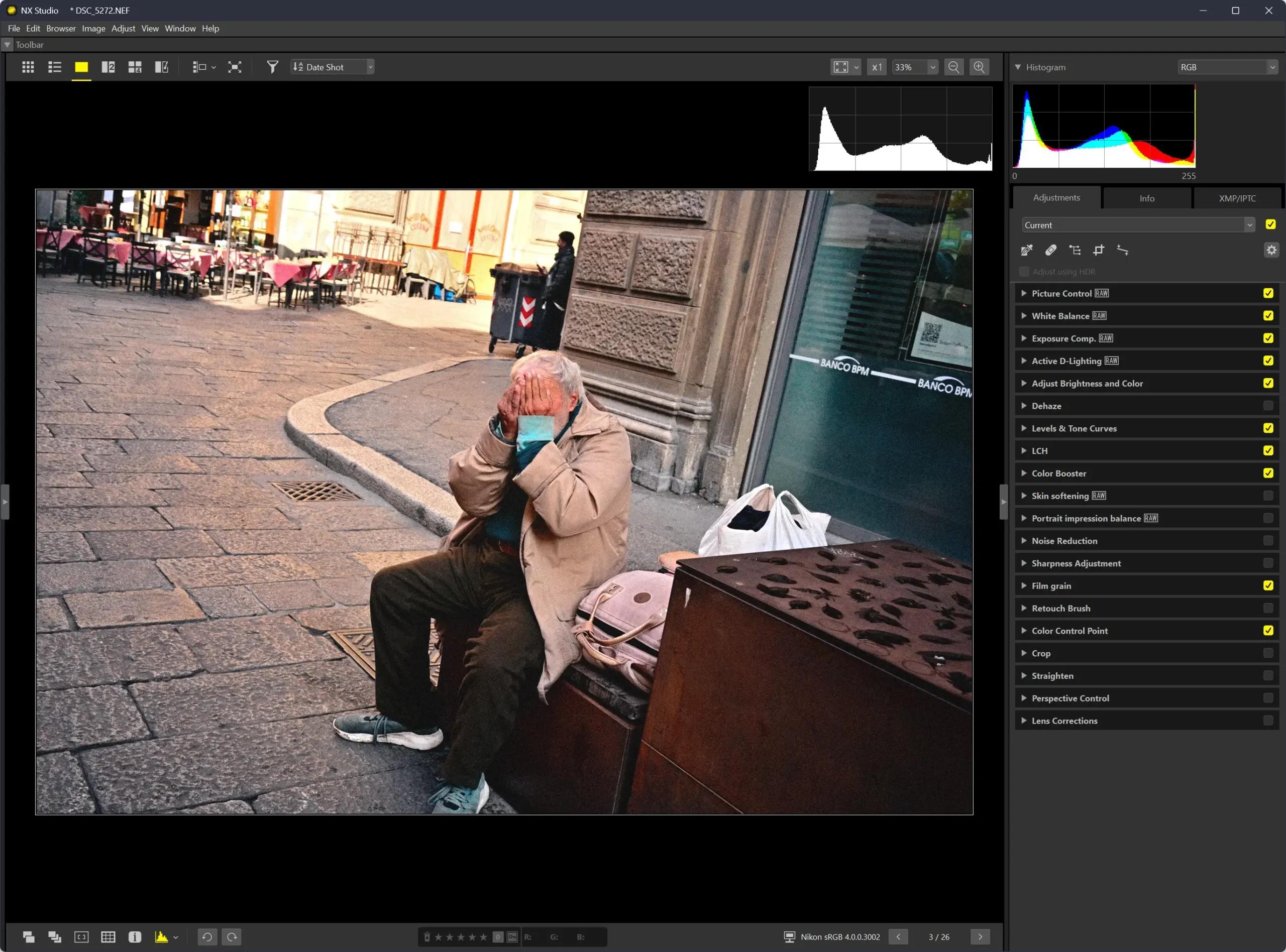
NX Studio is the RAW development software provided by Nikon to edit Nikon’s RAW files.
If you’re used to Lightroom or Capture One, at first glance, you might find NX Studio somehow limited. But depending on your editing needs, it might end up being all you need for your post-processing work.
I’ll go through some basic steps to discuss some of the benefits NX Studio has to offer, and to show how I’m using it to edit my pictures.
My workflow is not based on advanced color correction, as I find the RAW files generated by my Nikon Zf already good. That said, other than creating some customized Picture Controls, the other adjustments I usually apply are some basic contrast, local adjustments, and sometimes the LCH tool.
I will also briefly go through the Flexible Color settings.
The version of NX Studio I’m using, at the moment of this writing, is 1.10.0 for Windows.
For those who want to follow along, below you’ll find the same RAW file used in this quick walk-through, the adjustments, and my custom [FC].
The Setup
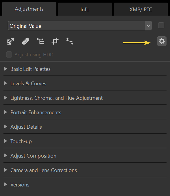
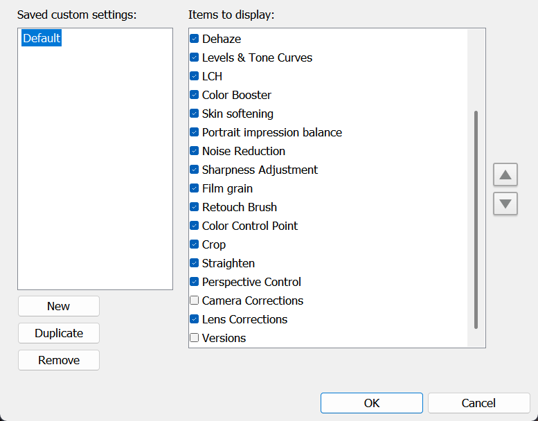
The first thing I do, is set up the workspace. There are adjustments I don’t use, so I remove them from the UI to keep it more tidy.
To do that, I click on the Customize Edit Tool button, and then I uncheck the panels I don’t need.
Prior to the introduction of Flexible Color, the only customization allowed for a Picture Profile was mostly limited to a custom curve applied to an existing Picture Profile (and the Creative Picture Control). You could still tweak saturation and hue, but that would affect the overall values of the image.
At this stage, one easy way to reset the image to its original values, is to choose the recorded Picture Control from the drop-down menu.
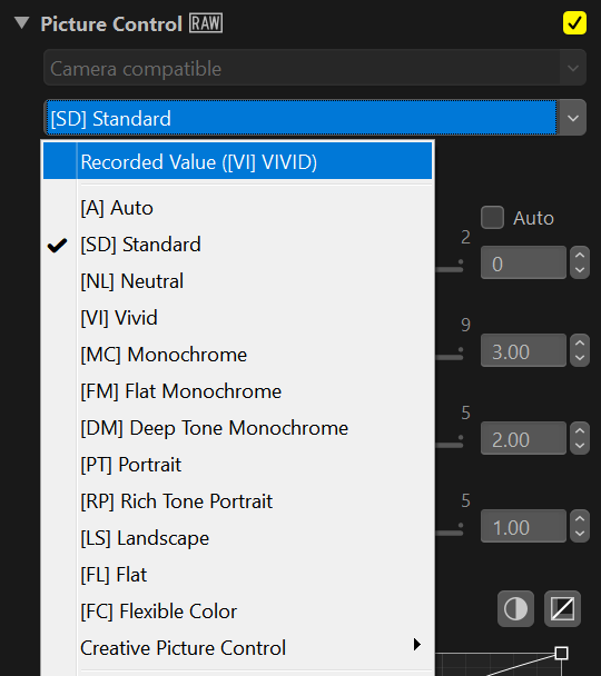
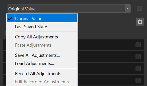
If you have already tweaked more than one adjustment, then you can restore the original by picking Original Value from the top drop-down menu.
You can also save your edit with Save All Adjustments, which stores all the changes made to a file (*.nka). It’s the closest we get to New Variants in Capture One terms.
The starting point—[FC] Flexible Color
As of November 5th, it seems there’s a bug affecting the Flexible Color workflow. After saving the recipe, any further change to any setting, will cause the recipe to shift chroma entirely. I reached out to Nikon to let them know about this issue, which is now under investigation.
With the introduction of Flexible Color, Nikon opened the door to more complex picture control customization, allowing their user base to finally explore a more creative way to customize the look of their pictures.
Nonetheless, I don’t think of the [FC] as a once-and-for-all solution, but rather, as a base look which might still need some tinkering in order to get the wanted result. Even in street photography, where the lighting condition changes so suddenly.
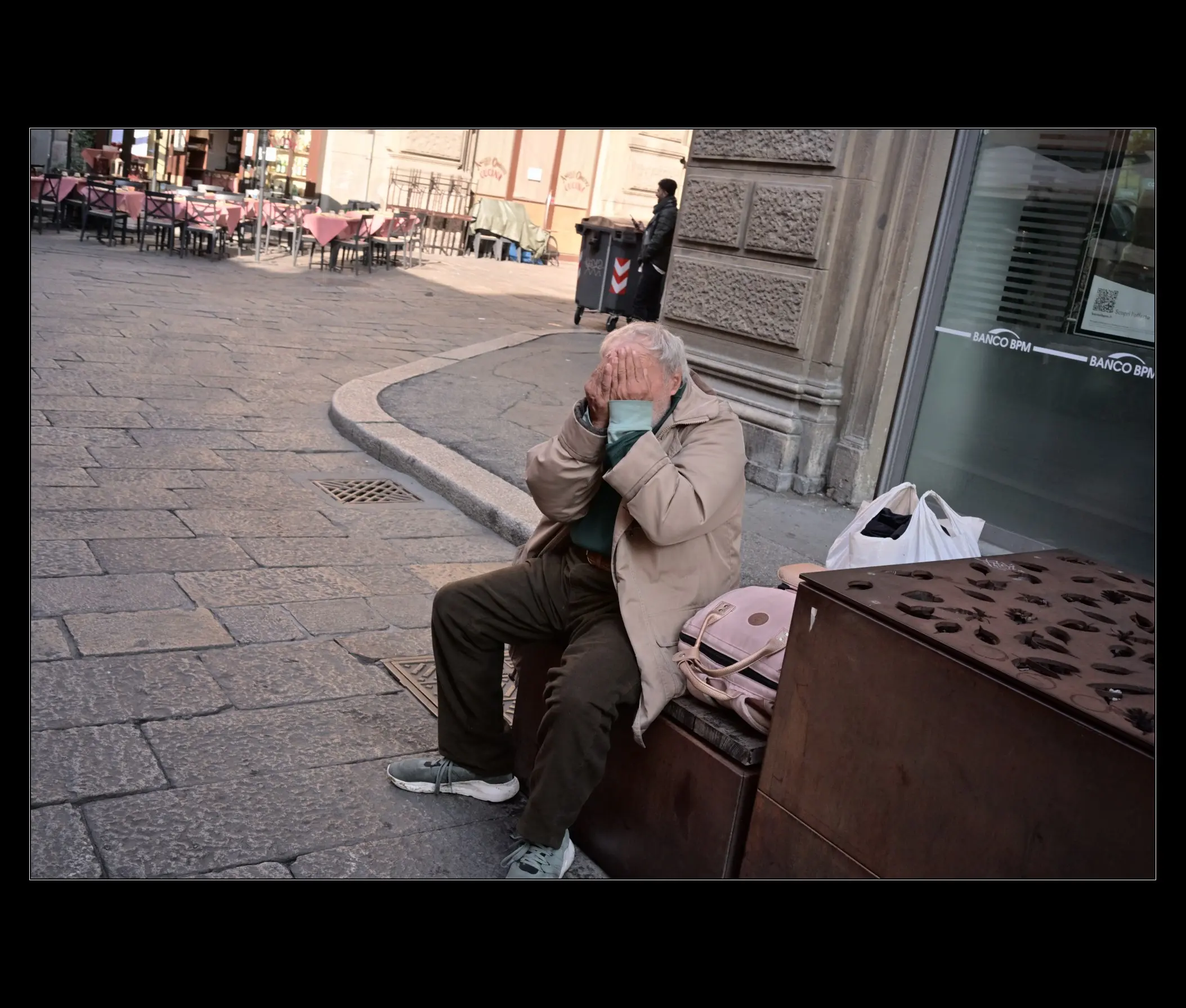
Before we delve into the [FC] settings, I’ll go straight to one of the last adjustments in NX Studio workflow, which is Color Control Point. I don’t always use this approach, but in this case, with the subject being underexposed, I think it will help to see a more balanced image from the get-go.
The Color Control Point is very easy to use. Just use the picker tool to choose the area you want to tweak, and then click on it. At that point, you can change the size of the area affected, and then the other values either from within the image viewer, or from the dedicated Color Control Point panel. Also, there are four type of models available in the drop-down menu: All, Bcs, Hsc, Rgb. One would expect that All would simply group every model together, but for some reason I’m seeing a Warmth slider which is not available in the other models. I’m not sure whether I’ve overlooked something or if it’s just a bug.
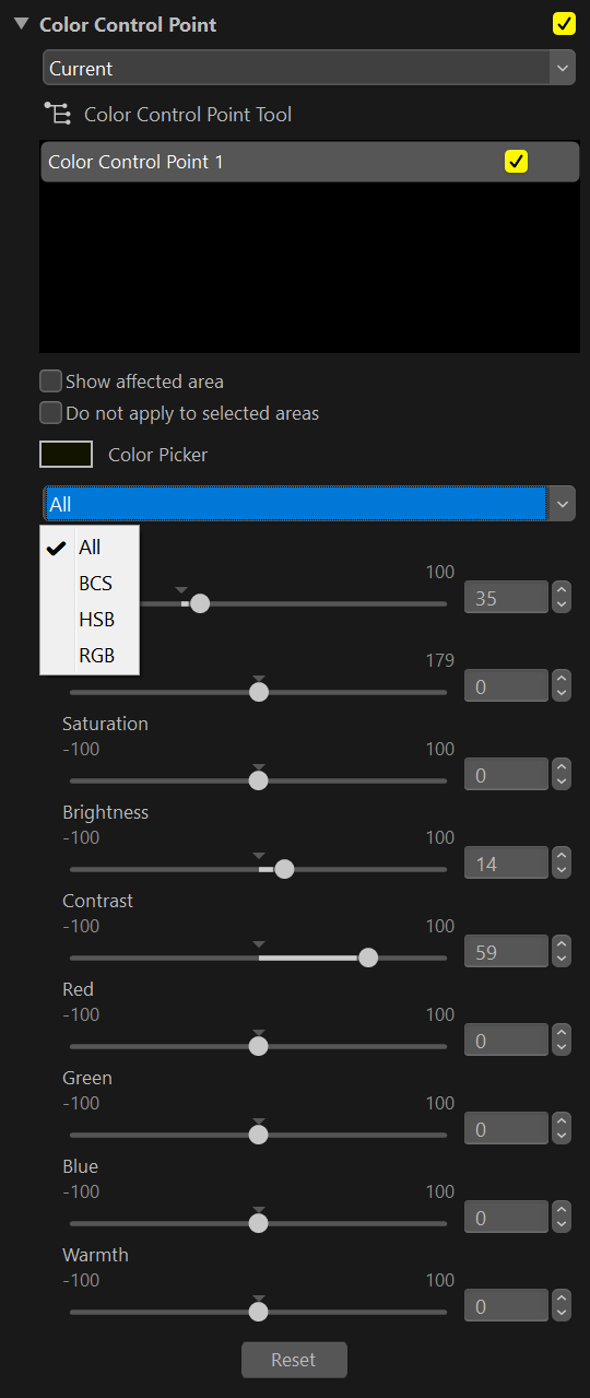
By clicking the Color Control Point Tool underneath the drop-down menu, the gizmo in the viewport disappears.
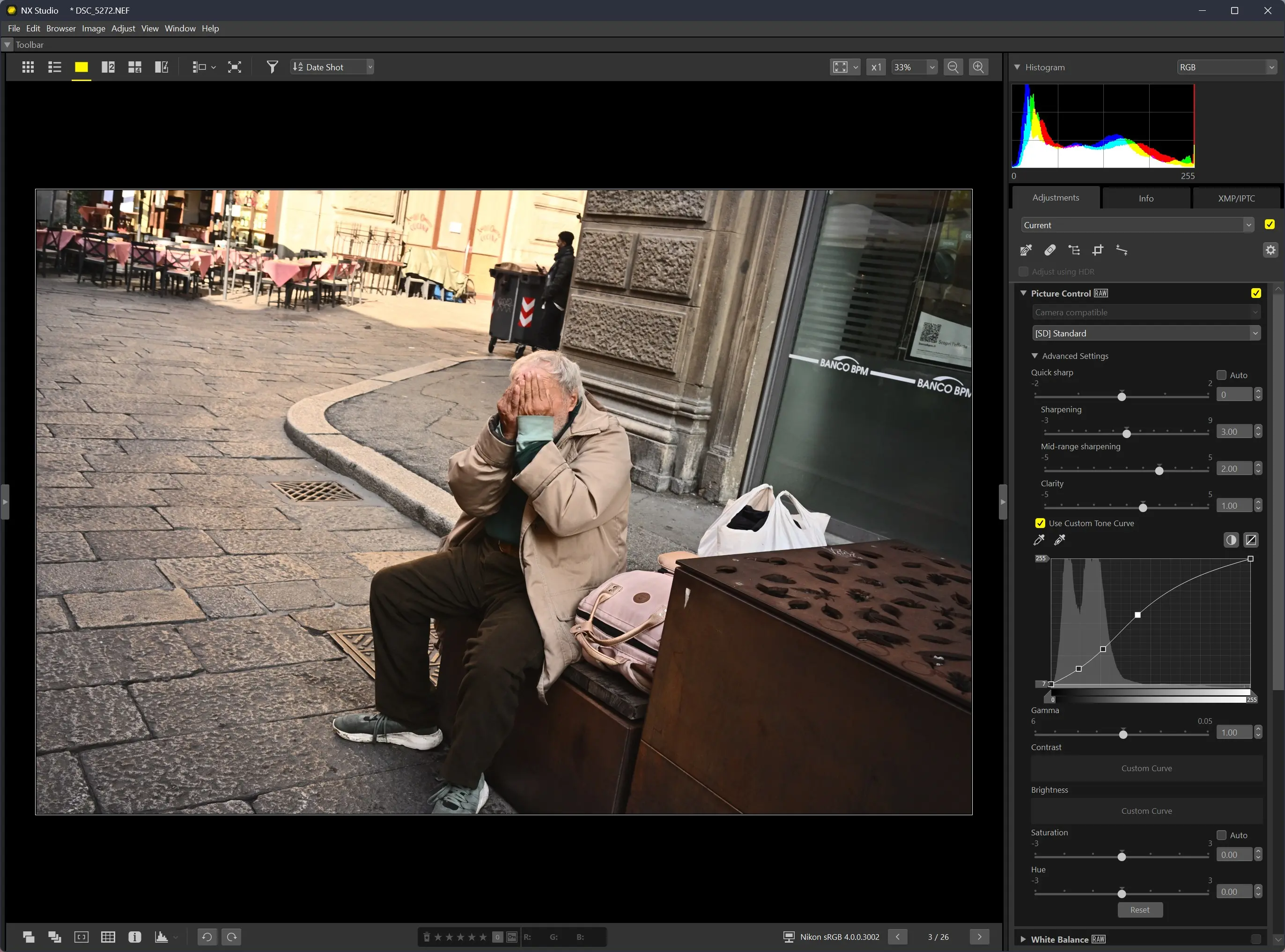
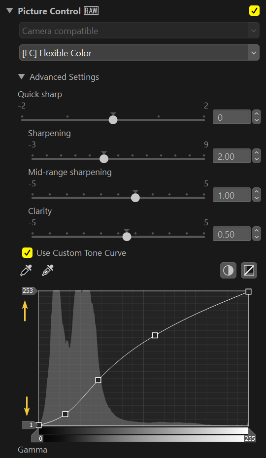
After selecting [FC] from the Picture Control, the image will look washed out, closer to a flat profile, that will allow us to customize every aspect of the final look from the ground up.
In this particular case, the white balance is off. Depending on the look we are after, the warm tone could actually work in our favor. For now, I’ll simply use the Gray Point Sample Tool (alternatively, the Cloudy white balance will do just fine in this case).
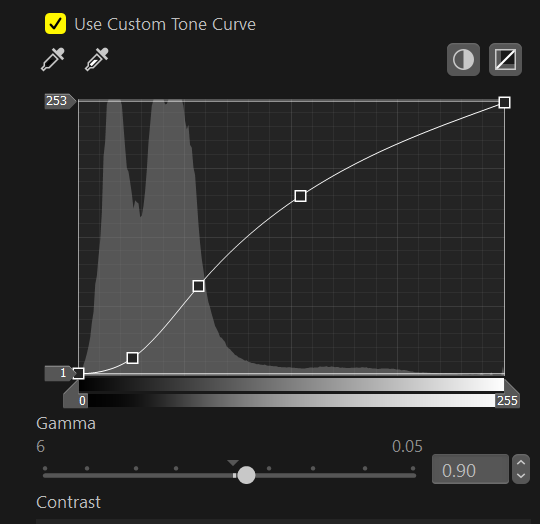
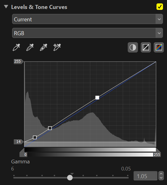
With that out of the way, let’s head back to the Flexible Color. In this case, we have the option to use either a custom curve, as with the old Picture Control customization, or a series of slider for Contrast, Highlights, and so on. I personally still find the custom tone curve to be a better option, but your mileage may vary.
I usually start with the usual s-curve, while also compressing highlights and shadows just a bit.
Another way of playing with the overall contrast is to pull back the gamma and keep fine-tuning the tone curve.
By now, a couple of annoying hiccups with NX Studio should have become clear:
- Tweaking the curve’s dots can be finicky. The curve panel can be enlarged horizontally, but not vertically, limiting the area that we can cover when adjusting the dots’ position. Having the option to make the curve panel bigger or, even better, having a pop-up option to open a larger version of it, would be ideal (just like in DaVinci Resolve).
- A slightly less annoying issue, and this is probably just me being used to other software, is that you can’t type “.” followed by a number in the fields’ value. Due to my habits, I would expect this type of input to become “0.”, but that’s not the case here.
If there’s any workaround to either one of the two issues above, I’d love to know.
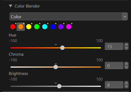
The Color Blender is a powerful tool, but I would advise being careful with the changes here, especially when dealing with skin color. Some more aggressive tweaking might seem to work fine on one image, only to turn another image into a piece of faux art.
For my custom [FC] recipe, I tweaked the orange so that there’s a little more yellow into it, and it’s also a touch brighter.
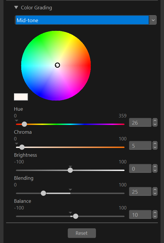
I also pushed the chroma for the warm tones in the color grading adjustment, and tweaked the blending.
With my custom [FC] applied, the image looks too dark for my taste, so I compensate with the Exposure adjustment.
Another option offered by Nikon’s technology is Active D-Lighting. I have it on Normal, but sometimes even High can yield good results.
Now that we have a fairly balanced image, it’s time for the fun part.
Pushing the look
I encourage using the following adjustment, such as Brightness and Contrast, while being careful not to crush those values (unless, of course, that’s exactly the look one is after). As a personal preference, I do what I can to avoid 100% black or white values as to me, they tend to make the image look more digital, thus resulting in a less pleasing picture.
Highlight Protection is especially useful when dealing with tricky highlights (except, of course, if they’re really gone). The only slider I never found myself using is the D-Lighting HS.
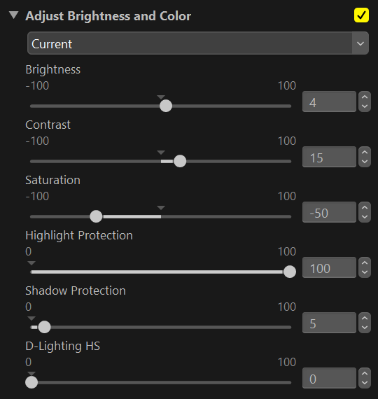
Something I started doing lately is adjusting the darks with Levels & Tone Curve, especially now that we have grain in NX Studio (raising the darks yields a pleasing result to my eyes). But I guess this is just me experimenting with the look of my images, so it could only be a fad 🙂
Which brings us here.
Moving next, we have the LCH panel, which is quite useful. Again, since to me Nikon’s files don’t need much correction, I use the LCH mostly for those extra touches which help to bring the look home.
In this case, I’ve used it to push the saturation for the skin tone, as well as the cool tones to get a nice complementary contrast. It’s pretty straightforward: just pick the chroma value you want to tweak, and then start pulling the dot upwards or downwards whether you want that color more or less saturated. Also, keep an eye on the Width slider right below it, as that will allow you to expand the surrounding area of the chroma value.
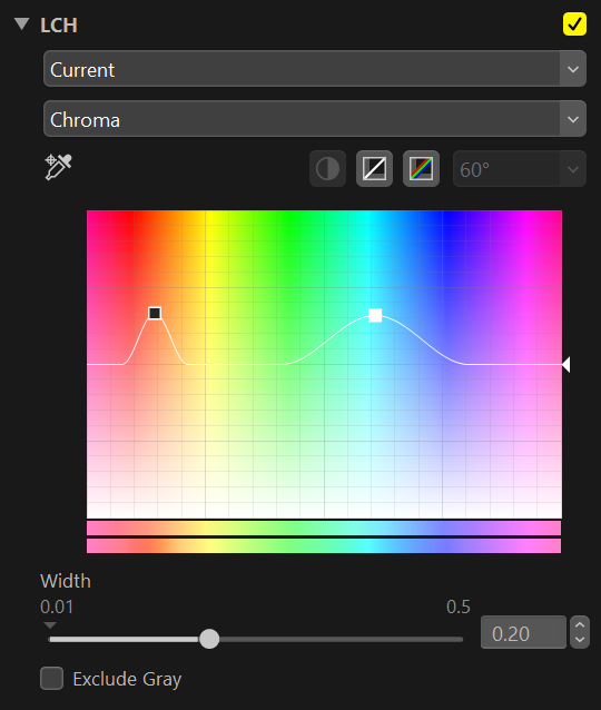
Here’s the result after the LCH adjustment.
The Color Booster is another tool I neglected for the longest time. I’m not even sure if it’s been there since the first release of NX Studio I started using, but it’s another nice extra push. Only, in this case, you need to be careful as there aren’t many settings as for LCH. It’s just one slider, with the option to pick two options: People or Nature. I never use Nature as I find it more aggressive.
The last tools are Noise Reduction and Film Grain. I always keep the noise reduction off, both in-camera and in NX.
Nikon’s Film Grain
Film Grain is a really nice addition. I usually go with grain size large and intensity about 2, sometimes 3.
Below, I’ve added 100% crop of different grain settings so that it will be easier to judge the result.


Intensity = 1
Size = Large


Intensity = 2
Size = Large


Intensity = 3
Size = Large


Intensity = 4
Size = Large


Intensity = 5
Size = Large


Intensity = 6
Size = Large
Overall, it seems to me that with size large, the grain gets softer (the smaller the size, the sharper it looks).
Here are all the adjustments used for the final edit.
Before and after of the edited picture.
Conclusion
I’m really enjoying NX Studio. It’s a neat software that is receiving some nice updates from Nikon.
I understand the usage really depends on one’s own need, so I don’t expect it to be the RAW development paradigm. At the same time, it has a lot to offer for those who don’t need to spend extra money on something more complex, offering the chance to work with an all-round software to complete their Nikon’s workflow. Plus, it’s free 🙂
Leave a Reply