This is a challenging city for people who want to take photos in an urban environment, or maybe not, depending on what the photographer is looking for. Still, it’s kind of a unique place. One may find similarities between, say, New York, Chicago, Philadelphia, Boston, and so forth, but not with LA.
Distance is really something here. You can see lots of cars, but not a lot of pedestrians. And even the streets, which you would expect full of cars, suddenly might look empty.
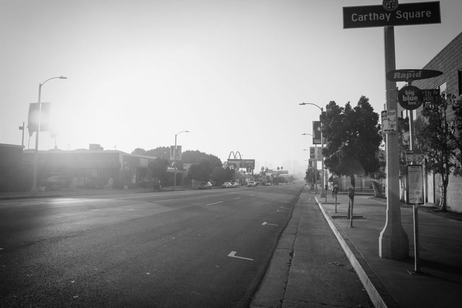
Alright, that’s a street of no particular interest. Let’s see what’s going on in Downtown, then:
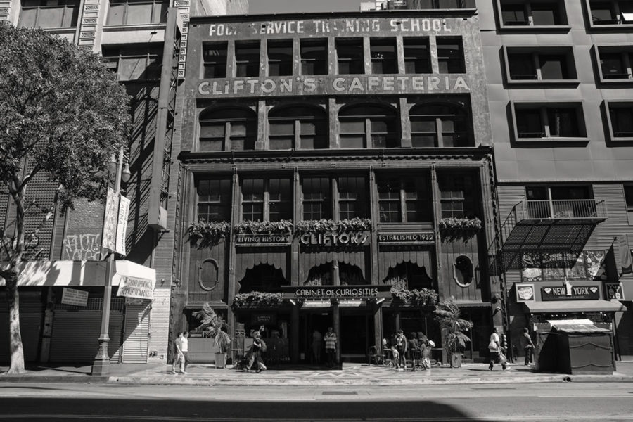
That’s as busy as it can get on a Saturday on Broadway, in front of an iconic LA place.
Back on Pico:
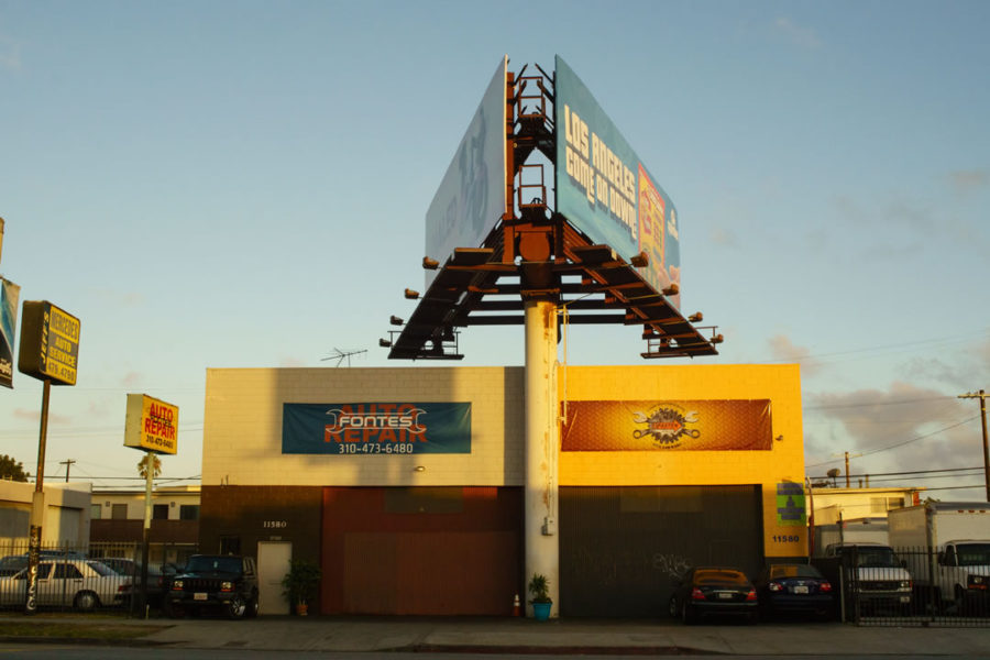
Now, considering I don’t take pictures of homeless people, I’m not interested in landscapes, buildings, flowers, wildlife, staged pictures, or portraits, the only thing left, which is people, is not an element easy to find here.
Anyway, I keep trying, although I have to admit sometimes it gets a little discouraging. These might not be the streets of my beloved European cities, nor Tokyo or other major, more traditional urban-like style cities such as New York, nonetheless there are people
though, because of a different environment (i.e., physical space and the way people relate to it), habits and behavior are different as well.
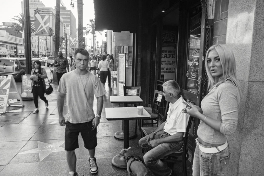
The back view issue.
Another thing I tend to avoid, besides photographs of homeless people, is back views. It just feels effortless, an act of a lazy person, it’s a frame that lacks interest as we don’t see the face. That said, I took the picture shown below because I thought that, despite only seeing the back of the two gentlemen, their posture and the rotation of their heads, should be enough to make the connection with the sign the woman is holding. Whether that’s enough to turn it into an interesting picture or not, well, that’s a different story.
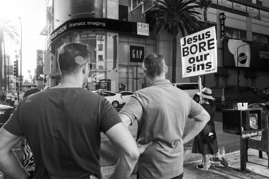
A few things I don’t stress about.
My own pictures.
All in all, I don’t care too much about the pictures I take. I enjoy taking them, and I have fun when I edit them, but that’s it. The interest I can have in wondering whether a picture works or not is strict because of my interest in the discipline itself, not the picture in particular. In other words, when I look at my photographs, I look at them as a means to figure out what photography is to me, not the photograph itself.
Picture perfection.
Both in the picture of Clifton and the one about Auto Repair, there’s some quite noticeable lens distortion going on. I just don’t care. And I don’t, not because the pictures I posted here are among those I don’t consider good enough to end up in my gallery. I’m not obsessed with perfection for the pictures that go in the gallery, either.
I think nowadays we have become obsessed with perfection.
To begin with, it’s just annoying and boring. It seems everything needs to fall into the perfection rule basket, turning the majority of the images we experience every day, treated as they were clones or as if they had been produced in a factory. But even more terrifying is the idea of perfection itself. What is perfect, and how do we judge that anyway? “Beauty is in the eye of the beholder,” someone might add. As if the beholder doesn’t have his own prejudice, as if his notion of beauty has not been trained over the years by what the beholder experienced around him, his culture, and his level of knowledge.
What makes one’s idea of beauty more valid than someone else’s? Here it gets complicated. It is not the intention of this post to investigate further into this topic.
For now, let’s just say that distortion can be part of beauty. Greeks did this centuries ago when they built their columns. I still remember my high-school teacher explaining that there’s a connection between the oval shape of our eyes and the way we perceive, which is why we don’t see perfect, straight lines, but curved lines and that’s what Greeks have done with their columns:
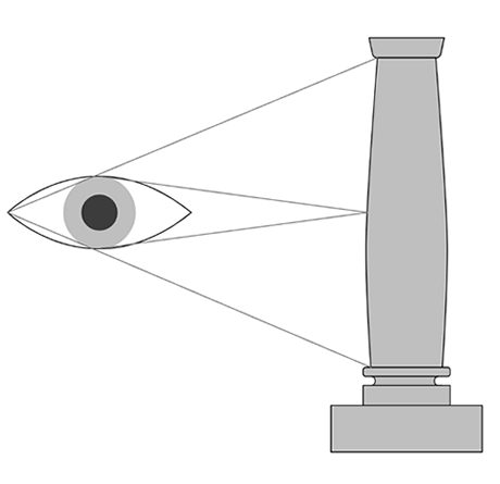
That also explains why theaters’ screens are curved, which is basically to compensate for the distortion along the edges at the peripheral areas.
The same applies to the lens choice:
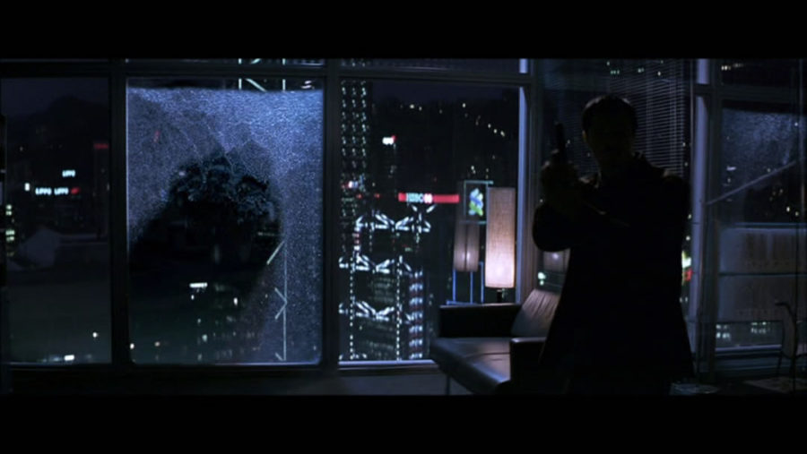
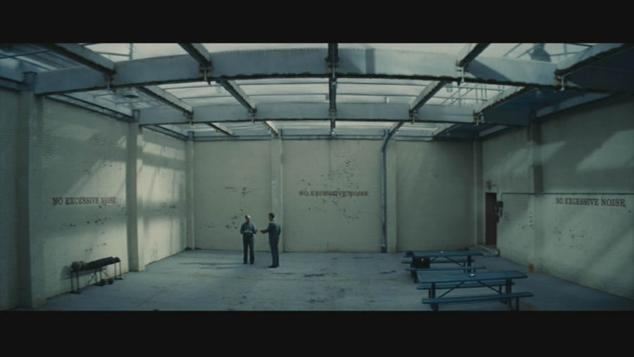
The two examples above might look exaggerated, especially the screen grab from Bridge of Spies. The thing is, when we watch a film, we don’t pay attention to these details, as our brain has to keep up with a lot of things happening at the same time (acting, direction, light, music, etc).
When I watched Bridge of Spies the second time, I wanted to pay attention to some details as it was kind of more analytical watching. Even though I knew about lens distortion and how the brain compensates for it, there were scenes from the movie that literally tricked my perception. When I was pausing on a frame, the distortion was there, clearly noticeable. When I was playing back the scene, the distortion was gone. That’s part of what can be achieved with good camera blocking.
Leave a Reply